Фінансовий менеджмент: практика управління бізнесом
Експертна база знань для CFO, генеральних директорів та власників бізнесу. Практичні кейси, стратегії максимізації прибутку та глибока аналітика.
Вітаю! Мене звати Дмитро. Я фінансовий директор з понад 20-річним стажем. Маючи професійні кваліфікації CAP (МСФЗ) та ACCA (Financial Management), я створив цей ресурс як фундаментальну базу знань з фінансового управління. Тут систематизовано мій практичний досвід роботи у виробництві, девелопменті та інших сферах. На сайті ви знайдете не швидкоплинні новини, а ґрунтовні матеріали, що не втрачають актуальності: практичні кейси, глибоку аналітику міжнародних стандартів та стратегії оптимізації бізнесу.
УПРАВЛІННЯ ФІНАНСАМИ→
Корпоративні фінанси та інвестиції: гід CFO
Розвиток бізнесу вимагає розумного управління капіталом. Цей розділ присвячений оцінці інвестицій, залученню фінансування та структуруванню угод M&A. Знайдіть стратегії для масштабування вашої компанії.
Управлінський облік та планування бізнесу
Точні цифри дозволяють передбачати майбутнє компанії. У цій рубриці ви знайдете інструменти бюджетування, фінансового моделювання та контролю витрат. Налаштуйте облік так, щоб він працював на результат.
ФІНАНСОВА ЗВІТНІСТЬ→
Стратегічна звітність: Ринки капіталу та ESG
Звітність як інструмент управління ринковою вартістю бізнесу. Вивчайте стратегії виходу на біржу, впровадження ESG та аналіз балансу. Перетворіть цифри на довіру інвесторів.
Довідник МСФЗ (IAS/IFRS)
Повний реєстр чинних в Україні МСФЗ (IFRS), МСБО (IAS) та Тлумачень (IFRIC/SIC). Завантажуйте офіційні переклади стандартів (PDF) та читайте авторські аналітичні огляди. Актуальність: 2026 рік.
Рекомендовано до прочитання
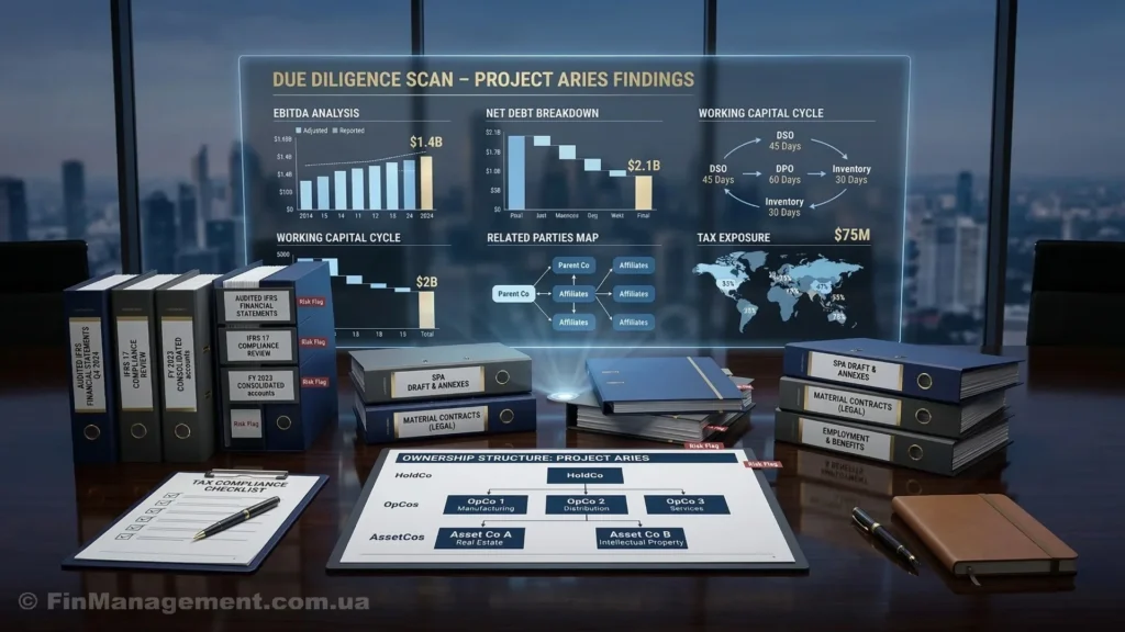
Фінансовий Due Diligence: Як українському бізнесу підготуватися до заходу інвестора

Трансформація звітності для ради директорів: від цвинтаря даних до стратегічного навігатора

Перетворіть операційну метушню на гроші: Як TOC, Lean та Six Sigma працюють разом

Стратегічна архітектура стійкості: Як побудувати систему управління ризиками для малого та середнього бізнесу

«Зворотний» вихід на Nasdaq: обліковий парадокс як шлях для українського бізнесу
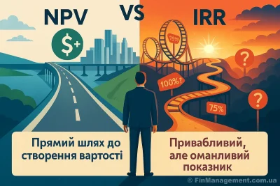
IRR vs NPV: чому популярний метод оцінки інвестицій може вас обманути

Бюджетування як навігаційна система бізнесу: від «кайданів» до моделювання

Токсичні KPI: Як неправильна мотивація вбиває прибуток

План = Модель. А якщо ні – то це не план, а список надій.

Інтегрована звітність: від добровільної ініціативи до нового стандарту корпоративної прозорості

МСФЗ для МСП – огляд